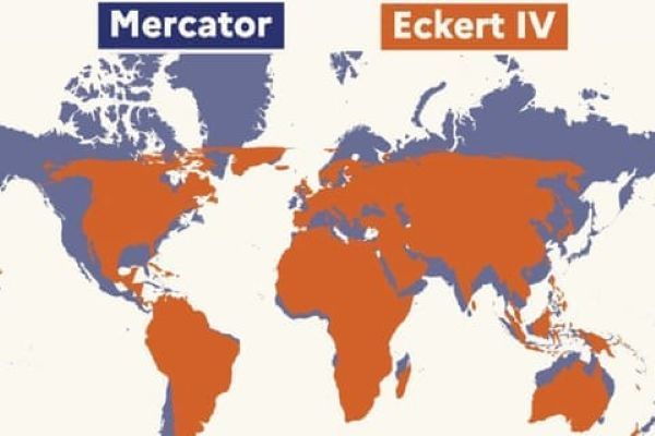
The maps above provide different 2-dimensional representations of Earth. The deep orange is an Eckert IV Earth-Equal projection. The one beneath, in purple without Antarctica, is a Mercator projection.
When I was in public school, it was the Mercator view of the world that was prominently displayed in my schools. What it showed was a flat world with straight lines of latitude and longitude. To do this, the mapmaker had to exaggerate the dimensions of countries near the poles. One of those was Canada. It made what was already the second-largest country by land area much bigger than reality.
Canada’s landmass is approximately 25% larger in area than the Continental United States. On the Mercator projection, however, Canada looks 2 to 3 times bigger. As for South America and Africa, they appear smaller than their real size.
Why create a map with straightened lines and distorted landmass perspectives? It was Gerardus Mercator who took on a task in 1569 to produce a map useful for sailors. With straightened lines, it turned the Earth’s sphere into a cylinder that made using a compass easier.
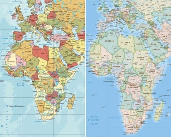
Imagine when Europeans and North Americans serving as teachers in Africa unrolled their Mercator maps. How did their African students perceive their distorted and reduced continent mounted on classroom walls?
What cultural harm did Mercator unintentionally unleash with his map drawn over 450 years ago?
Certainly, it must have reinforced Eurocentric and Northern Hemisphere dominance over what seemed like such a small piece of the planet. How could Africa be as important as Denmark’s Greenland, which was shown as 14 times larger?
The map’s widespread adoption by educators and governments from the 18th century onward shaped the mental map of the world. Mercator’s Global North appeared super-sized.
Even though Antarctica also appeared exaggerated, few questioned its representation at the bottom of the Mercator map, while in reality, the southern continent landmass was half the size of Africa.
A Course Correction Long Overdue
Navin Vasudev recently wrote in the Africa Edition of University World News about the map that was “hanging in my childhood classroom.” Navin was born in Africa. The map he saw was the Mercator projection of the globe. He describes “how well the lie was socialized into us, first in school, and then, unchallenged, all the way through university.”
On September 4, 2026, the lie Navin describes was openly named in the United Nations General Assembly, where the nations of the world voted 164 to 1, with 6 abstentions, to correct history. African nations and the Bahamas led the charge to do away with the Mercator Projection, adopting the Earth-Equal projection that proportionately shows the continents more accurately.
Reality trumping the distorted perception of Earth required a long-needed course correction. It will take a while to work its way through all two-dimensional visual representations of Earth. The Mercator Projection will only vanish slowly. That’s how entrenched it has become in textbooks, atlases and classroom walls around the world.
For Africans, its removal is one of the last vestiges of a colonial past. Navin poses the question: “Can a change to the world map decolonize?” He answers his own question with a “No!” But he believes it can give fresh impetus to driving Africa’s future. Selma Malika Haddadi, Deputy Chairperson at the African Union Commission, noted, “It might seem to be just a map, but in reality it is not.”
Why Size Matters When It Comes to Historical Perspective
For Africans, distorting the size of their continent suggested that a place like Greenland, from a global perspective, was far more important.
Why is that? The human species is very much attuned to size. It matters whether we are measuring anatomy or projecting power and authority. Here are just a few examples:
- See a very tall person and what comes to mind? “Do they play basketball?”
- Most of the leaders who we vote for are taller than average.
- More corporate CEOs are taller than average.
- Because women, on average, are shorter than men, many cultujres pay less attention to them.
- So righting the world map to give Africa, South America, Australia, and other parts of the Mercator-projected world a course correction does matter.
Who Voted “No” on Changing the Map and Why?
The sole vote against the resolution to move away from Mercator’s world projection came from the United States. The abstentions came from Estonia, Georgia, Lithuania, Moldova, Serbia and Ukraine.
The vote was not binding, only symbolic. It didn’t force any country or group to alter their two-dimensional representations of the planet.
So why not support the vote in principle for addressing a wrongful historical perspective?
In the General Assembly, the United States argued that a change from the Mercator map was an endorsement of extreme politics. It was about ideological bias and distracted from “substantive global issues.”
The U.S. argued that the vote was “values-driven” and “superfluous,” and that it undermined the United Nations’ credibility as an organization dedicated to solving “genuine problems of international peace, prosperity or good relations.”
In other words, the resolution was “woke.”
As for why Estonia, and the others, abstained, maybe the perceived size of the two Baltic countries on Mercator projections versus Earth-Equal maps was the motivation. At least they didn’t vote “No.”
For the “Correct the Map” campaign, the Earth-Equal map doesn’t really make Africa appear much bigger (see the image comparison atop this posting). What it does do is project Global North countries that were the African colonizers to no longer appear oversized and, therefore, symbolically over-represented by the 450-year old Mercator map.